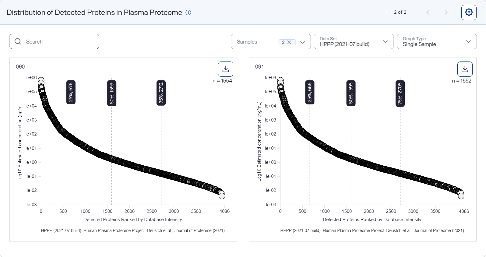
Distribution across Proteome graph
The Distribution across Proteome graph shows the dynamic range of proteins identified in each sample compared to a deep reported human plasma proteome index.1, 2
1Keshishian, Hasmik, Michael W. Burgess, Michael A. Gillette, Philipp Mertins, Karl R. Clauser, D. R. Mani, Eric W. Kuhn, et al., “Multiplexed, Quantitative Workflow for Sensitive Biomarker Discovery in Plasma Yields Novel Candidates for Early Myocardial Injury,” 14, no. 9 Molecular & Cellular Proteomics (September 2015): 2375–2393, https://doi.org/10.1074/mcp.M114.046813.
2Deutsch, Eric W., Gilbert S. Omenn, Zhi Sun, Michal Maes, Maria Pernemalm, Krishnan K. Palaniappan, Natasha Letunica, Yves Vandenbrouck, Virginie Brun, Sheng-ce Tao, Xiaobo Yu, Philipp E. Geyer, Vera Ignjatovic, Robert L. Moritz, and Jochen M. Schwenk, “Advances and Utility of the Human Plasma Proteome,” 20, no. 12 Journal of Proteome Research (December 2021): 5241–5263, https://pubs.acs.org/doi/10.1021/acs.jproteome.1c00657.
The n-value equals the number of proteins detected in the sample that were also detected in the index.
The x-axis plots the number of identified proteins ranked by database intensity. The y-axis plots the intensity calculated in the database using the logarithm base 10 (log10) function. Each protein appears as a circle on the plot.
How to open and use
-
Hover over a circle to view the name of the protein and the exact intensity values.
-
Use the scroll arrows and page numbers to move through all the graphs.
-
Annotate proteins you want to highlight, as shown in red in the figure above.
-
Select or clear wells in the Samples list to show or hide the corresponding graphs.
-
Find specific graphs by entering a keyword or term in the Search field.
-
Switch to a different dataset by selecting an option from the Data Set list.
-
Use the Graph Type list to switch the graph type.
-
Single — Shows a graph for a single sample.
-
Overlay — Shows the ranked intensities (x-axis) only for all samples, enabling comparison across multiple samples.
-
For an overlay graph, group data by selecting an option from the Group By list.
-
-
Select
 button") Settings to customize the graph. See Set preferences for the Distribution across Proteome graph.
Settings to customize the graph. See Set preferences for the Distribution across Proteome graph.Style the graph to include the information you want before downloading it as an image file. The graph reverts to its default settings each time the page loads.
- Select
 Export to export the selected graph in SVG, PNG, or CSV format.