Sample Comparability graph
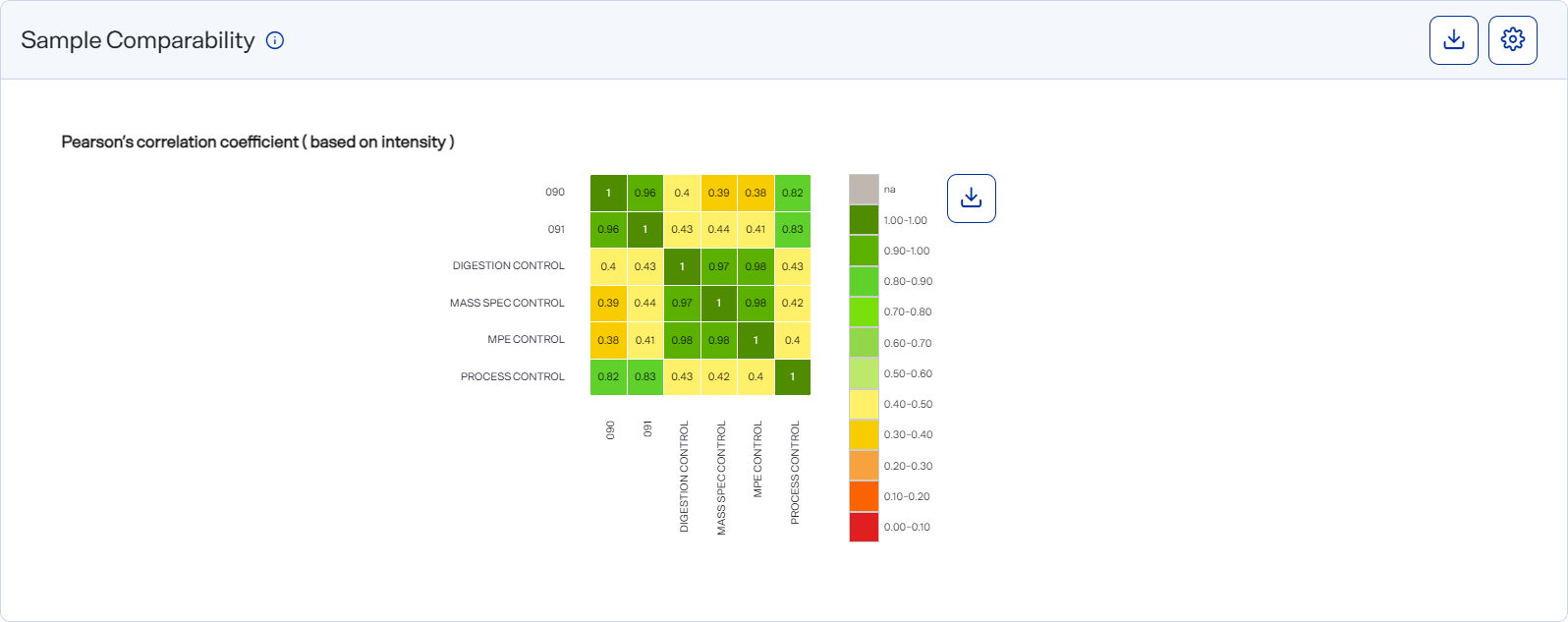
The Sample Comparability graph shows the degree of statistical correlation between samples based on the Pearson’s correlation coefficient (PCC) and the similarity in protein groups between samples based on the Jaccard Index, which measures the linear correlation of data. You can switch between the PCC and Jaccard index.
Each matrix is color-coded for easy reference. Samples on the green end of the spectrum have high correlation. Samples on the red end of the spectrum have low correlation.
A color-coded matrix shows sample comparability data using PCC (top) and the Jaccard index (bottom)
How to open and use
-
To open this graph, select
 Analyses, select an analysis, select the Analysis Results tab, and scroll down to the Graphs section. Then select the Sample Comparability Chart tab.
 -
Select a cell on the matrix to view a scatter plot that compares two samples.
-
Hover over a dot on the scatter plot to view the intensity of a single protein.
-
Select
 button") Settings to customize the graph. See Set preferences for the Sample Comparability graph.
Settings to customize the graph. See Set preferences for the Sample Comparability graph.Style the graph to include the information you want before downloading it as an image file. The graph reverts to its default settings each time the page loads.
-
Download graph data as a .csv file by selecting the CSV option from
 Download.
 -
Download a graph as an image file by selecting an image option from the
Download on the graph.