PCA Analysis graph
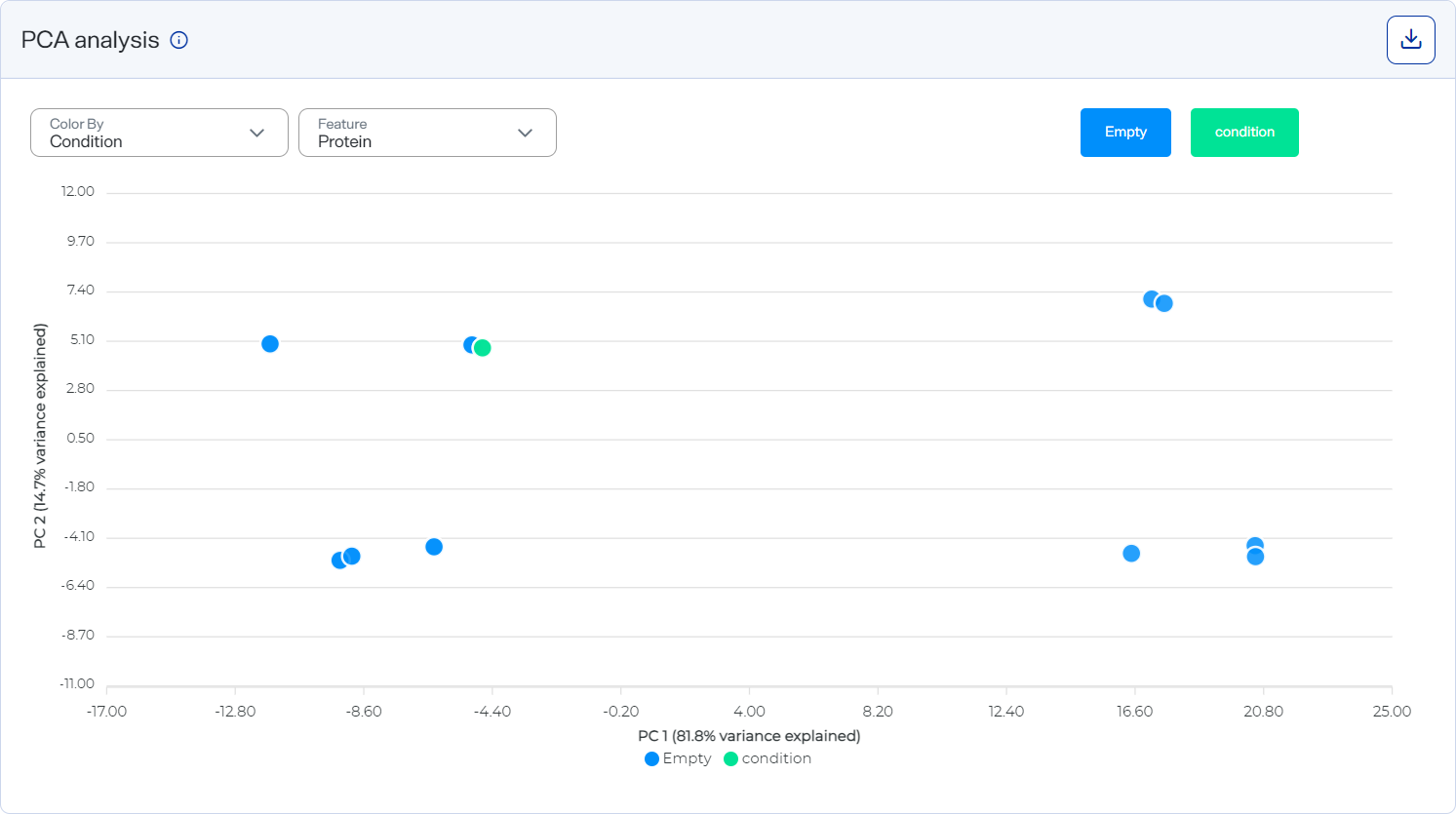
The PCA Analysis graph clusters similar samples in a scatter plot.
The x-axis plots principal component 1 (PC1) analysis scores, and the y-axis plots principal component 2 (PC2) analysis scores. Each dot represents one sample.
Scatter plot showing clusters of similar samples
How to open and use
-
To open this graph, select
 Analyses, select an analysis, select the Analysis Results tab, and scroll down to the Graphs section. Then select the PCA Analysis tab.
 -
Hide a sample by selecting its dot under the x-axis.
-
Hover over dots to view sample and plate names.
-
Change the color scheme of the graph, such as by Condition or Sample Name. See Change the color scheme of the PCA Analysis graph.
Style the graph to include the information you want before downloading it as an image file. The graph reverts to its default settings each time the page loads.
-
Download graph data as a .csv file by selecting the CSV option from
 Download.
 -
Download a graph as an image file by selecting an image option from the
Download on the graph.