Intensity Distributions graphs
The Intensity Distributions graphs show the protein and peptide intensities and the distribution of protein sequence coverage for each sample, including the coefficient of variation (CV).
The default chart type is a density plot, which you can change to a violin plot.
-
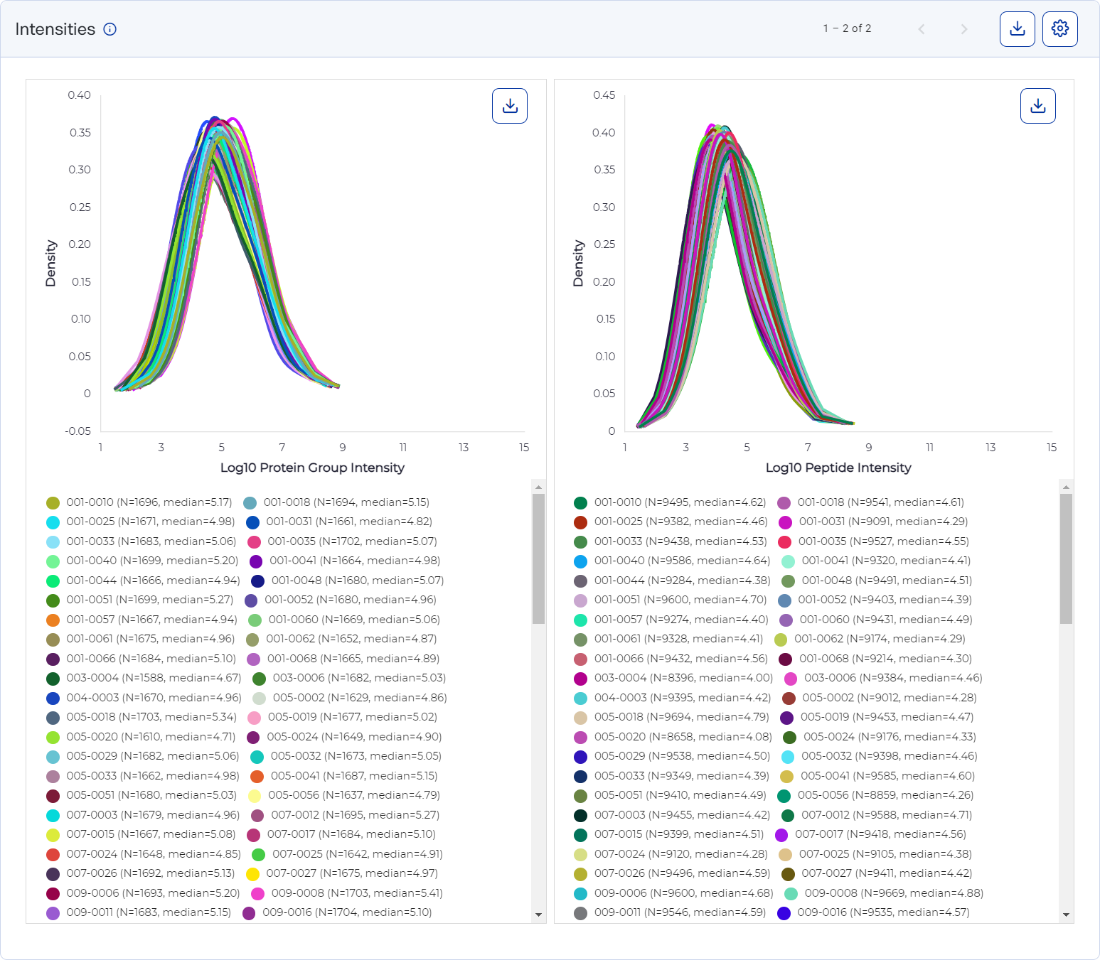
On a density plot, the full distribution of data for each sample is shown as a continuous curve. The x-axis plots intensity and the y-axis plots density.
-
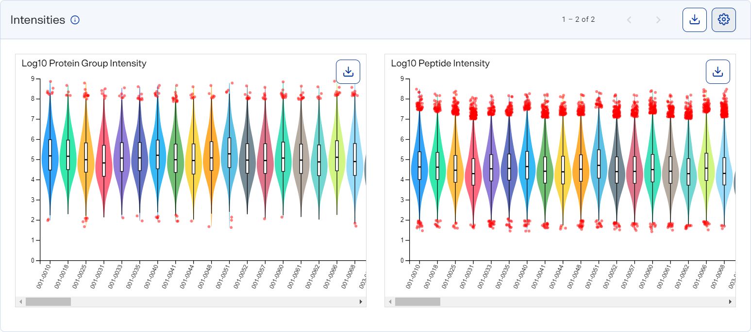
On a violin plot, data for each sample is shown as quartiles displaying the full distribution of data. The sample appears along the x-axis and the y-axis plots intensity. Box plots represent quantile ranges with box plots with density on either end. Red dots represent outliers.
Density plot (top) and violin plot (bottom) showing the intensity distribution for a sample
How to open and use
-
To open this graph, select
 Analyses, select an analysis, and select the Analysis Metrics tab. This graph is shown by default.
 -
Use the scroll arrows and page numbers to move through all the graphs.
-
For the density plot:
-
Move the mouse pointer along the curve to view the exact intensity value at each point in a curve.
-
Hide a line by selecting its label in the legend.
-
-
For the violin plot:
-
Hover over a box plot to view the quantile for a sample.
-
Hover over a dot to view an exact outlier value.
-
-
Select
 button") Settings to customize the graph. See Set preferences for Intensity Distributions graphs.
Settings to customize the graph. See Set preferences for Intensity Distributions graphs.Style the graph to include the information you want before downloading it as an image file. The graph reverts to its default settings each time the page loads.
-
Download graph data as a .csv file by selecting the CSV option from
 Download.
 -
Download a graph as an image file by selecting an image option from the
Download on the graph.