Enrichment graph
You can view the Enrichment graph for a completed group analysis.
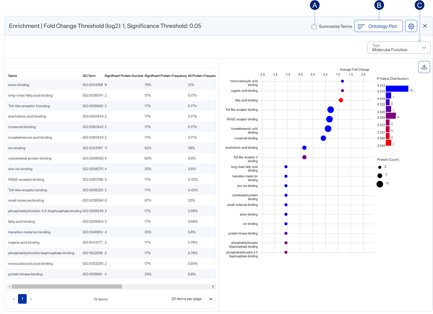
Here you can functionally characterize proteins showing abundance difference between groups compared by performing gene ontology (GO) enrichment.
Enrichment plot, shown as an ontology plot (hierarchical tree)
-
Select to condense similar terms by family.
-
Select to display the plot as either a Dot Plot or Ontology Plot.
-
Select to switch between GO categories.
How to open and use
-
To open after running a group analysis , select Enrichment on the Group Analysis toolbar.
-
Use the list to switch between GO categories: Molecular Function, Biological Process, and Cellular Compartment.
-
To set the cutoff (adjusted p-value upper limit), select
 Chart Settings on the graph.
 -
Display the GO term enrichment as either:
-
 Dot Plot — To “condense” similar terms by family (i.e., condense all children from each superfamily), select the Summarize Terms checkbox.
 -
 Ontology Plot (hierarchical tree)
-
Hover over a box to view GO information.
-
Use the mouse wheel to zoom into and out of the plot.
-
Drag the plot to reposition it so that you can examine different areas.
-
-