Coverage graph
You can view the Coverage graph on the Group Analysis panel.
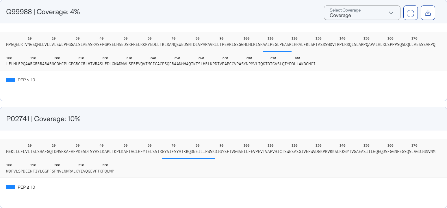
Here you can visualize the amino acid sequence of your selected protein and the regions where measured peptides map. You must select at least one protein in the table to the left of the graph.
Coverage is represented as percent (%) of sequence observed by measured peptides.
Coverage graph, shown in the default collapsed (summarized) view
How to open and use
-
To open after running a group analysis, select at least one protein in the data table and then select Coverage on the Group Analysis toolbar.
-
Use the table columns’ Filter options to show only values that are greater than, less than, greater than or equal to, or less than or equal to the value you specify or are between two values you specify. To apply the filter, select
 . To clear it, select
  .
.Filtering data this way offers you more control over what appears in the graph, particularly if you want to export different versions of it.
-
In cases where a PTM is detected for the selected proteins, select PTM from the Coverage list to view where the PTM occurs.
-
Select
 Expanded View to view individual peptides from different sample-nanoparticle measurements.
-
In this view, hover over a horizontal bar to view a PEP value.
-
-
Select
 Collapsed View to return to the summarized view.
 -
Download a graph as an image file by selecting an image option from the
 Download on the graph.