Clustered Heatmap graph
You can view the Clustered Heatmap graph for a completed group analysis.
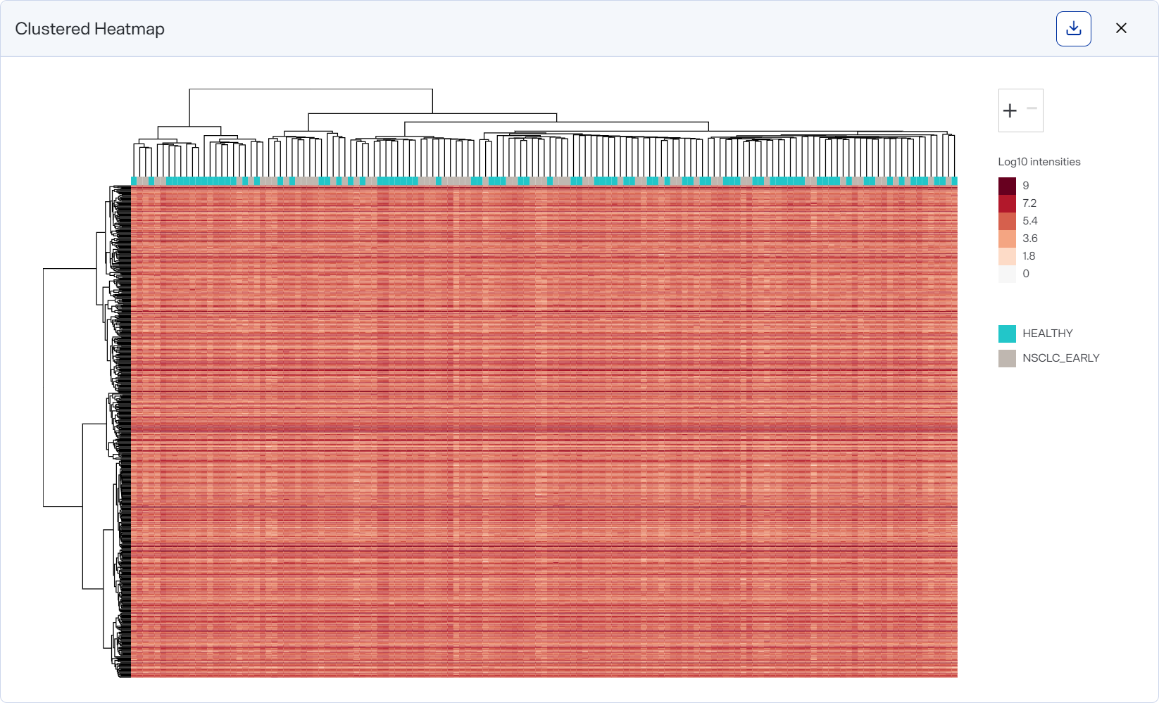
Here you can visualize protein abundances across samples, with both proteins (rows) and samples (columns) clustered based on agglomerative nesting. Cell colors range from blue (low abundance) to red (high abundance).
How to Use
-
To open after running a group analysis, select Clustered Heatmap on the Group Analysis toolbar.
-
Use the + / - buttons to zoom in and out of the graph.
-
Hover over a cell to view the protein or peptide name, sample name, and intensity.
-
Download a graph as an image file by selecting an image option from the
 Download on the graph.
 -
In the table at the left of the graph, use columns’ Filter option to show only values that are greater than, less than, greater than or equal to, or less than or equal to the value you specify or are between two values you specify. To apply the filter, select
 . To clear it, select
  .
.Filtering data this way offers you more control over what appears in the graph, particularly if you want to export different versions of it.