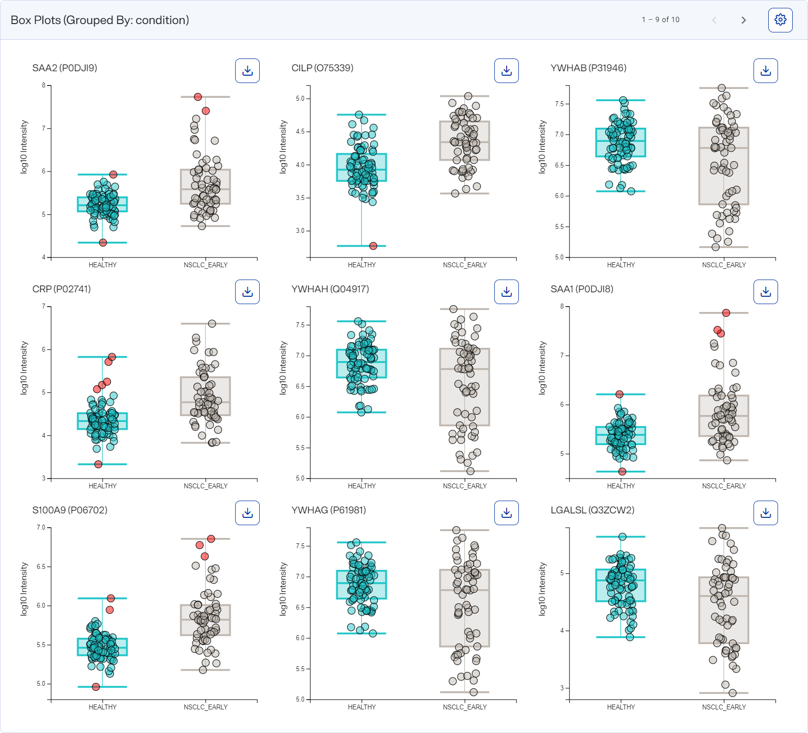
Box Plots graph
You can view the Box Plots graph for a completed group analysis.
Here you can visualize the intensity differences between groups of significantly different proteins.
How to open and use
-
To open after running a group analysis, select rows in the tabulated results table and then select Box Plots on the Group Analysis toolbar.
-
To change the layout for the charts, select
 button") Settings on the graph.
Settings on the graph. -
Hover over a dot to view a sample’s count, name, and statistics.
-
In the table at the left of the graph, use columns’ Filter option to show only values that are greater than, less than, greater than or equal to, or less than or equal to the value you specify or are between two values you specify. To apply the filter, select
 . To clear it, select
  .
.Filtering data this way offers you more control over what appears in the graph, particularly if you want to export different versions of it.